Overview
Scaling accessibility in large enterprises is challenging. Many companies begin by addressing known code issues, but as their accessibility practice matures, they shift focus to the design phase, where many issues originate.
In 2021, CVS Health’s accessibility team grew to over four dozen specialists supporting hundreds of designers in creating inclusive digital experiences. Our process included annotating designs for accessibility before handing them off to developers. These annotations conveyed essential intent and semantics not captured in visual design, aiding accessibility engineers and QA teams during testing.
However, as the team expanded, its tools and workflows became outdated. Design hand-offs became more complex, with feedback scattered across multiple platforms and formats, making it difficult for developers to follow.
The problem
How can we standardize and streamline our accessibility documentation so developers can build accessible experiences for all?
The team
- Lead Designer and PM (me)
- 2x Senior Accessibility Designers
The timeline
18 months of ongoing support and refinement
Outcomes
- Quickly became one of CVS Health’s top Figma libraries internally being used in over 1,100+ design files. An average of 4,200 stamp inserts made every week, with a record of 7,800.
- Widely adopted and scaled across the enterprise, it was used regularly by 33 agile teams within 5 months, and 65+ teams within 12 months.
- Contributed to a 22% decrease in accessibility defects across the organization.
- It became the first open-sourced project in the Design’s teams history and has now been downloaded over 3,000+ times.
Problem space
Lacking a single tool to ensure consistency and prevent many avoidable accessibility issues, we couldn’t create a standardized, scalable process.
The organization needed accessibility annotation kits that were intuitive and easy for our team. Therefore, I decided to leverage Figma, which could allow design specs to be delivered with inline accessibility annotations all at once.
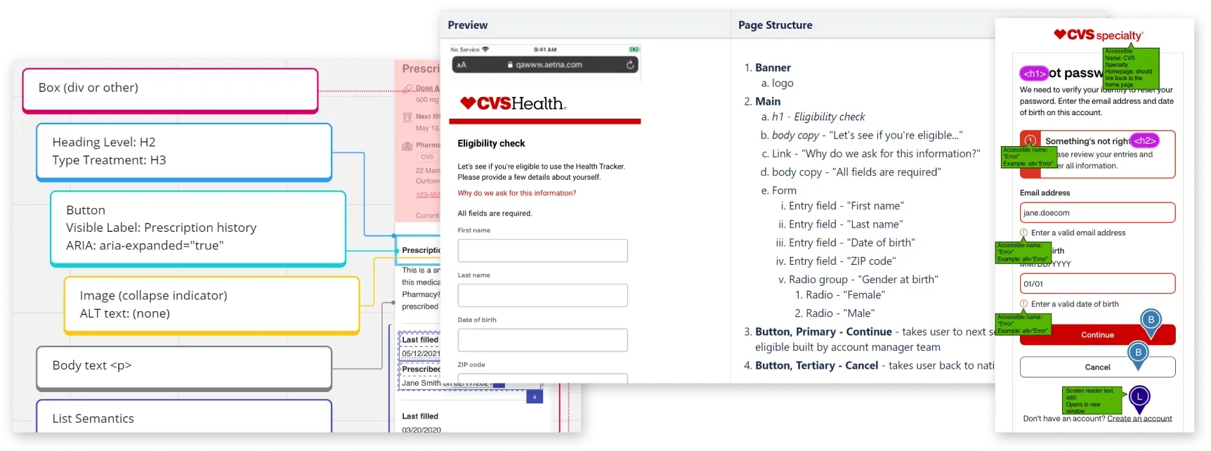
Figure 1: Highlights of the some of the existing annotations workflows on Miro, Confluence, and Sketch.
The next question was if it made sense to adapt an existing kit or create a new one.
At the time, there were a handful of Figma annotation kits from others such as Microsoft, GitLab, Twitter A11y, Indeed, and Intopia. We tested them on some of our designs to see if they could be used as a starting point. As we did so, we saw they presented some significant issues that would hinder us at scale:
- Many had accessibility issues with contrast, legibility, and even meaning. This could affect our colleagues and impact their ability to create and consume annotations.
- Many relied on directional arrows alone to annotate the content or interface. Our more complex designs often needed nested, hierarchical annotations, so this alone isn’t always sufficient.
- Kit components themselves were built in such a way that changing the direction of an arrow would erase any customizations.
- None contained every type of annotation we needed, so we knew we would need to make heavy alterations regardless of which kit we might choose.
- Seeing all of this, it was an easy choice to explore creating a new kit that improves upon the others in these key areas.
Accessibility principles
Although Figma itself isn’t an accessible tool, it’s where the Product Designers are working. Until that is no longer the case, we must make the most of the tools we have by creating with.
There are still plenty of WCAG Success Criteria that are applicable to creating a new tool, such as: 1.1.1: Non-text Content, 1.4.3: Contrast, 1.4.1: Use of Color, 1.4.12: Text Spacing, and 2.5.5: Target Size.
The 3 principles helped ensure our new kit was as accessible as possible:
- Multiple methods to differentiate annotations from designs by using accessible colors, fonts, and visual styles.
- Multiple methods to identify and differentiate annotations by using clear labels, icons, and outlines that help avoid relying on color alone.
- Flexible and robust components built without restrictions on dimensions, fonts, and directional references. Customize it easily and scale it quickly with minimal risk of data loss when using or updating components.
We also needed this kit to be easy to understand — and this applies as much to the pixels we draw as the language we use. Since the word “annotations” could refer to the documentation itself as well as individual components (and is also a mouthful), we have adopted the word “stamp” to refer to the different types of components.
Building the prototype
We began building annotation stamps based on immediate need and complexity: headings, landmarks, links, buttons, images, focus order, reading order, and a general freeform note. I made the decision to postpone the addition of complex annotations like form inputs, focus states, and keyboard controls until we had a proof of concept.
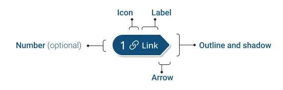
Figure 2: Diagram of an arrow stamp and its anatomy, highlighting an icon, text label, directional arrow, outline and shadow, and an optional reference number.
Following our accessibility principles to differentiate stamps from designs and one another, each stamp may have its own color, icon, text label, number, outline, shadow, and a directional arrow or outline.
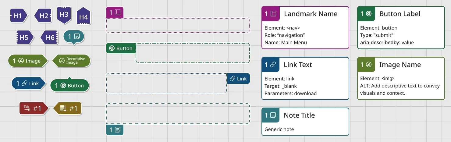
Figure 3: A full set of arrow, lasso, and detail stamps for landmarks, headings, links, notes, buttons, images, reading order, and focus order.
To make a flexible and robust kit, we would need multiple stamp formats.
Formats
- Arrow Stamps point to parts of a design within close proximity, pointing up, down, left, or right.
- Lasso Stamps outline to highlight an area of the design (such as landmarks regions). Labels also need to be able to change placement to reduce risk of overlapping other stamps or important parts of a design.
- Details components are numbered notes in the margins around a design. These could include code semantics, interface behavior, and more. Their numbers always correspond to numbers used by an Arrow or Lasso Stamp.
Stress testing for usability
I released our new kit to a half-dozen internal teams and collected data for the next four weeks. Stress testing included running co-design sessions, training people on how to use the kit, and trying to use the kit to annotate complex design system patterns. This gave insight into where it fell short, where my assumptions were wrong, and how to improve it.
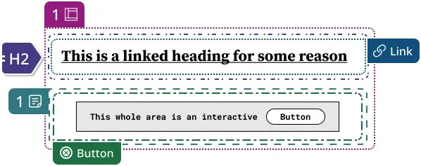
Figure 4: Five nested lasso annotation stamps with outlines that all have different dashed styles. It is difficult, at this level of complexity, to discern which is which.
Outline styles added more confusion than clarity
We thought distinct outline styles for each stamp type would help differentiate one type from another and help not have to rely on color alone. In practice, there was no real benefit. When complex components required multiple outlines inside or adjacent to one another, this became visually overwhelming, and it was harder to differentiate them from each other. So I decided the team should update all outline styles to use a uniform dash style.
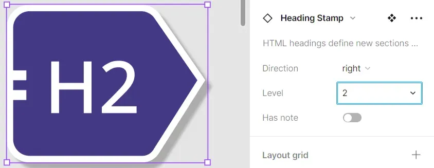
Figure 5: A heading annotation stamp’s heading level drop-down menu in Figma’s component properties panel.
People rarely used the heading level interface
Most of our accessibility designers preferred to edit heading levels on the stamp itself rather than use the component property drop-down. Since the scope of many design features is for components or small parts of a page, a heading level selector is too restrictive. Designations such h^n or h+1 might be used to indicate that the heading level should be one level deeper than whatever heading level precedes it. We replaced this selector with an open text property, leaving the heading level to the user’s preference.
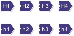
Figure 6: Two rows of four heading stamps. The top row has a capital H close to the number of the heading level. The bottom row has a lowercase H isn’t as close to the number, making it easier to discern the level of heading.
Heading stamps had poor cognitive accessibility
Through my close relationships with people who use the kit. A colleague with dyslexia reached out to me and said they found it difficult to discern the level of a heading stamp. Even though each level had dots on the left to help with this, the primary visual differentiation between levels came from the number itself. Through an inclusive design methodology, it was addressed this by making the “h” lower case and adding subtle spacing around it, which helped the number stand out.
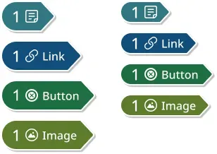
Figure 7: Two sets of four annotation stamps. The left set uses a ‘touch target’ height of 44px. The right set uses a height of 32px and takes up 3/4 the vertical space.
Size doesn’t matter (and makes other issues worse)
Drawing from WCAG Success Criteria 2.5.5: Target Size, the stamp height was set to 44 pixels. The assumption that a component on a Figma canvas could or should be a ‘touch target’ caused more problems than it solved.
Placing a lot of large stamps on a complex design can result in overlap and quickly become hard to read, diminishing the kit’s usefulness. And given the ease of zooming in on the canvas, it was just as easy to achieve ‘touch target size’ that way if needed. To give things a bit more room to breathe, I made the decision to reduce stamp height to 32px.
Refining the user experience
Making sure everyone can follow along
The end-users of accessibility annotations are the people reading them — developers and testers. No matter how well-designed the components are, we’re not solving any problems if the accessibility documentation isn’t easy to follow.
While we worked with developers often to test our assumptions, there will always be those who were new to our annotation process. With them in mind, we created a few utilities to ensure an intuitive and legible experience.
Pro-tip: No tool or kit is a substitute for the shared understanding that comes from talking to each other. We avoided a staggering number of miscommunications, errors, and money wasted trying to fix them by meeting with designers and developers to review our finished annotations.
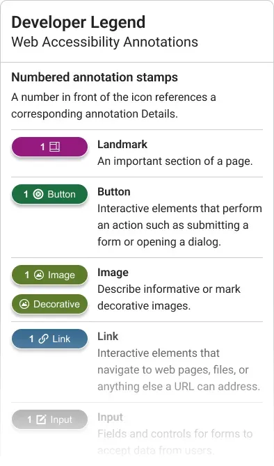
Figure 8: An annotation legend for developers to understand the purpose and format of each stamp.
Safeguarding against data loss
One of the kit’s early pain points was that our rapid iteration was leading to data loss. Unless the team took great care when updating this Figma asset library, some of the changes made to the components would erase annotations made by our testers.
Since annotations are one of the most important deliverables, the risk of them being deleted was a wake-up call. Without this tool to create consistent documentation, it wouldn’t be able to tackle things like scalable process or training. And if updates to the tool erased data, adoption could suffer enough to bury the project.
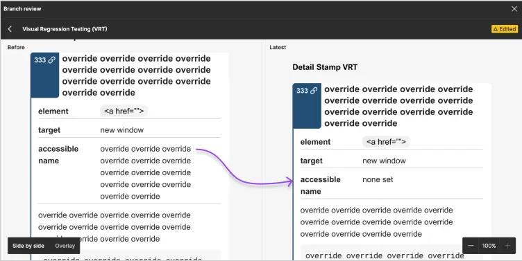
Figure 9: A Figma branch review comparing a filled out Details component in a Before view and Latest view. One of the filled out properties has been overridden by a component change.
Fortunately, I found a solution before this caused too much pain. To prevent data loss, I implemented Visual Regression Testing (VRT) for every stamp component. VRT is an internal library tool used to catch breaking changes, such as loss of data. They provide an opportunity for a human review to check that the update will not break an instance already consumed by a team.
This particular setup was so successful, I presented it to the rest of the CVS Health design system and was adopted by the Android and iOS libraries.
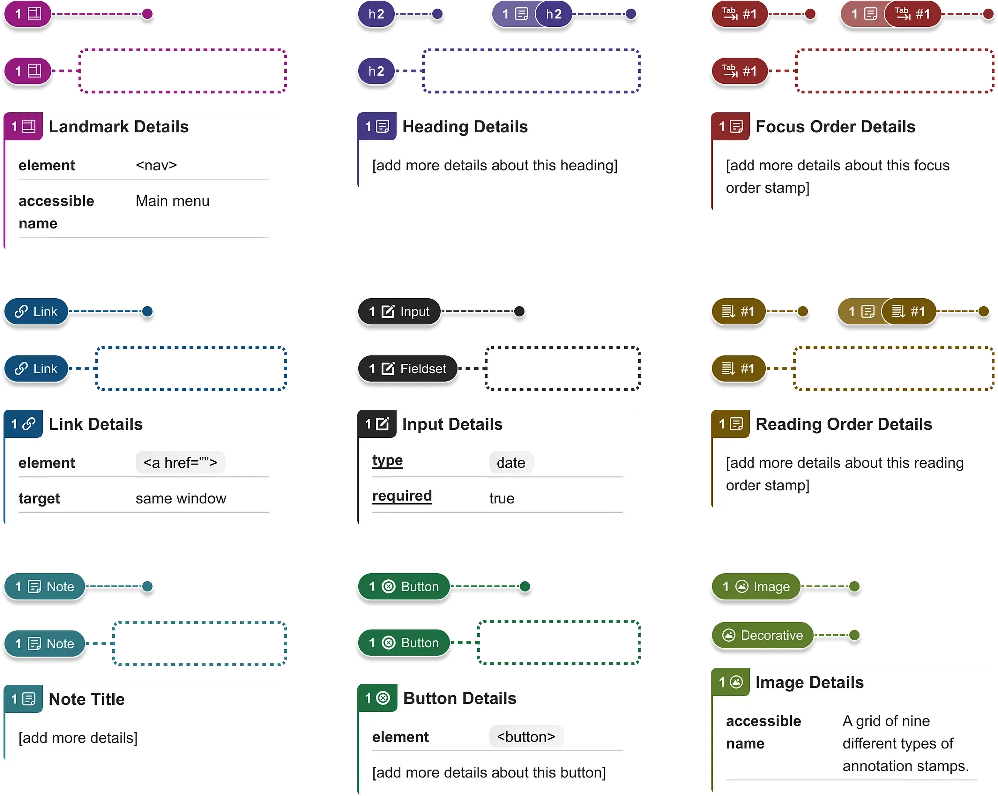
Figure 10: A grid of pin stamp, lasso stamp, and detail components for landmarks, headings, focus order, links, inputs, reading order, notes, buttons, and images.
A brand-new annotation kit
It was time to take everything I and the team had learned along the way and put it together. Leveraging new Figma features such as component properties, nesting, variables, and improved auto-layout features, we built a new kit from the ground up.
- Increased number of formats for all stamps, and a streamlined design for rare use cases such as headings, focus order, and reading order stamps that have notes attached.
- Many Input stamp variants with built-in parameters. This saved a lot of time and users were no longer having to look up semantics for different types of input. Building these into the kit also helped educate designers about how their forms work.
- Avoided fixed values so that fonts and dimensions could be changed by anyone who wants to customize the kit.
This accessibility annotation kit focuses on everyone, from those creating annotations to those consuming them. It’s highly configurable and easy to use — even for novices. To me, its best feature is how it helps build accessibility maturity through common vocabulary and patterns for colleagues across disciplines.
Charles Hall Domain Expert, Inclusive Design & Accessibility Invited Expert, W3C Accessibility Guidelines Working Group
There are many other things I could add, but it might be more illuminating to just let you see it in action:
Bonus: Figma community release
I worked closely with Legal and Brand teams to create the official Figma account for CVS Health, and then publish the annotations kits for the community to use.
- It became the first open-sourced project in the Design’s teams history and has now been downloaded over 3,000+ times.
- Has now been used as the foundation for GitHub’s own accessibility annotation kit.
- I worked with the Figma product team to beta test their DevMode Annotations feature.
- Presented the concept of annotations and the kit on a dedicated Figma webinar (recording coming soon).