Overview
On October 5th, 2023, the Web Content Accessibility Guidelines (WCAG) 2.2 was officially published as a W3C recommendation.
The CVS Health Design System is a critical driver in creating accessible, barrier-free experiences for 55 million digital customers. A key requirement of this goal is ensuring the design system conforms to WCAG standards.
When we began developing the design system, I took a proactive approach by aligning components with the WCAG 2.2 working draft, even before it was finalized. While I knew the language of the guidelines might evolve, the core intent and user needs would remain consistent.
The problem
How how can we use the design system to future-proof products with upcoming WCAG updates?
The team
- 2x Senior Product Designer
- 3x Senior Software Engineer
- Senior Accessibility Designer (me)
The timeline
6 months
Outcomes
- Designed for 8 upcoming success criteria during the initial creation of the design system.
- Acheived WCAG 2.2 conformance before it became the new W3C recommendation.
- Enabled consuming teams to go beyond the minimum requirements at the time.
Participation in the W3C
In 2022, CVS Health joined the W3C (World Wide Web Consortium) as a member organization. The membership enables experts to join working groups developing new W3C standards.
Along with contributing to the CVS Health design system, I was chosen to represent CVS Health in the Accessibility Guidelines Working Group (AG WG), which maintains and develops WCAG. This participation provided access to upcoming guidelines at its earliest point and an opportunity to drive improvements to all digital experiences on the Web.
Creating the Inclusivity pillar
Inclusivity is one of the three pillars of the CVS Health Design System. In collaboration with the Design System Director, we created this shared principle to make sure the team always considers how components can create equitable experiences since its inception. Throughout the component design and development process, I was constantly referring to future versions of WCAG, as well as changes to existing guidance and new supplementary guidance using the wealth of public research and collaborating with Fable to conduct studies with disabled people.
CVS customers approach our digital experiences with many different contexts, perspectives, and abilities. Our overarching goal is to create our design system with an inclusive design methodology to produce the building blocks for equitable experiences.
Creating more inclusive experiences through the design system will ultimately lead to better health outcomes and brand reputation.
With accessibility, this isn’t just the right thing to do. We are also obligated to create accessible experiences that conform to WCAG (Web Content Accessibility Guidelines). To achieve this, we have considered accessibility in everything the design system delivers and even go beyond the minimum requirements.
We have the support of inclusive designers and researchers, as well as accessibility engineers. This partnership ensures our styles are perceivable (meet color contrast ratios, etc.), that our components are understandable, operable and robust, and that our design patterns consider the human impact and communicate component relationships accessibly.
CVS Health Tech Blog
What were the new success criteria?
There were 9 new success criteria in WCAG 2.2. Of that set, 8 applied directly to the design system:
- 2.4.11 Focus Not Obscured (Minimum) (AA)
- 2.4.12 Focus Not Obscured (Enhanced) (AAA)
- 2.4.13 Focus Appearance (AAA)
- 2.5.7 Dragging Movements (AA)
- 2.5.8 Target Size (Minimum) (AA)
- 3.3.7 Redundant Entry (A)
- 3.3.8 Accessible Authentication (Minimum) (AA)
- 3.3.9 Accessible Authentication (Enhanced) (AAA)
3.2.6 Consistent Help (A) was the one success criterion that did not apply to the design system. However, if a “help” or “support” component existed, then it likely would have.
2.4.11 Focus Not Obscured (Minimum) (AA)
When a user interface component receives keyboard focus, the component is not entirely hidden due to author-created content.
In the Card component, its link sits close to the edge of the Card border. So much so, the links’ focus indicator breaches the boundaries of the Card.
Figure 1: A link focused within the Card component with the focus indicator not being obscured by its container.
However, since the focus indicator is not obscured, such as hiding any Card overflow, it conforms to the normative language and intent of 2.4.11 Focus Not Obscured (Minimum).
I wanted our focus indicator to be highly visible, so we made it 4px wide. However, when our Link component is used in-line, its focus indicator will likely clash with surrounding text. Since the focus indicator covers the text, rather than the other way around, it conforms to 2.4.11.
Figure 2: A list of Link components with the focus indicator present and visible above any surrounding content.
If the consuming team has a position override, this may cause z-index issues and create a failure. This was a good reminder than accessible components can be misused and create inaccessible experiences.
2.4.12 Focus Not Obscured (Enhanced) (AAA)
When a user interface component receives keyboard focus, no part of the component is hidden by author-created content.
This success criterion is similar to the previous one, apart from this one specifically calls out no part is hidden. The examples shared previously in 2.4.11 Focus Not Obscured (Minimum) are the most likely scenarios in our system to have a partly covered focus indicator.
But since they are not obscured in any way, they also provide conformance to 2.4.12 Focus Not Obscured (Enhanced), as long as teams implement the components as intended.
2.4.13 Focus Appearance (AAA)
When the keyboard focus indicator is visible, an area of the focus indicator meets all the following:
- is at least as large as the area of a 2 CSS pixel thick perimeter of the unfocused component or sub-component, and
- has a contrast ratio of at least 3:1 between the same pixels in the focused and unfocused states.
The CVS Health Digital Design System defines the focus indicator for all components as:
- 4px (0.25rem) wide/thick
- 4px (0.25rem) offset
- The outline color is black #000000, or white #ffffff
The reason we provide two options of design tokens for the focus indicator is so that no matter what background color a component is used on, it can conform to 2.4.13 Focus Appearance, providing a visible focus indicator for people who need it.
The Button and Link components are the most common components to be used on multiple backgrounds, so the components have Default and Reversed variants for the same theme, which enables designers and engineers to more easily implement a control that provides the best experience for users.
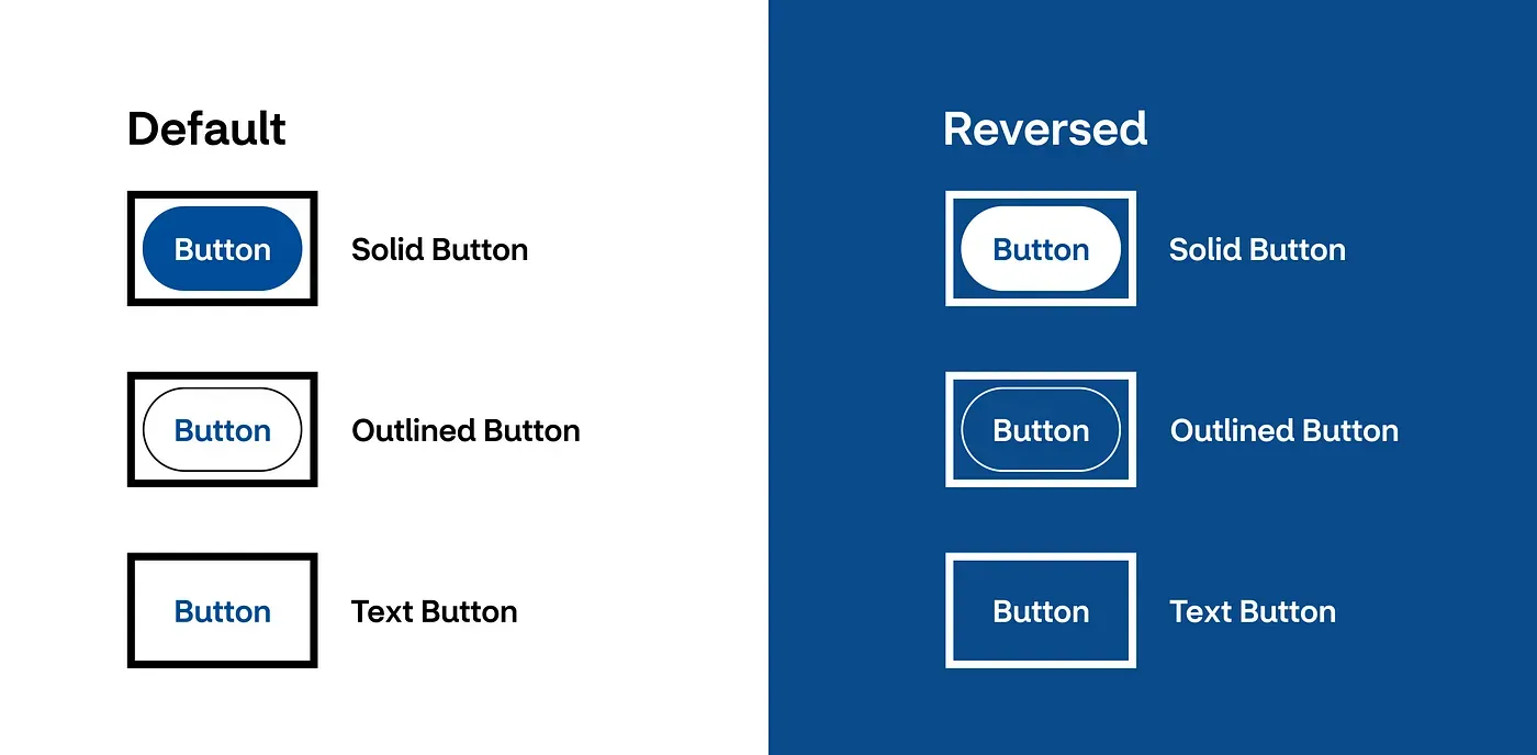
Figure 3: The collection of Button components in their Default and Reversed variants.
Due to the indicator color options being at either end of the color spectrum, there will always be a color contrast of at least 4.5:1.
Along with the indicator being 2x the minimum thickness required, the design system provides a low barrier path for teams to conform to 2.4.13 Focus Appearance.
2.5.7 Dragging Movements (AA)
All functionality that uses a dragging movement for operation can be achieved by a single pointer without dragging, unless dragging is essential or the functionality is determined by the user agent and not modified by the author.
The only component that supports dragging movement on our web platform is the Tabs component. If the tab list is visually wider than the viewport, the content can be accessed horizontally.
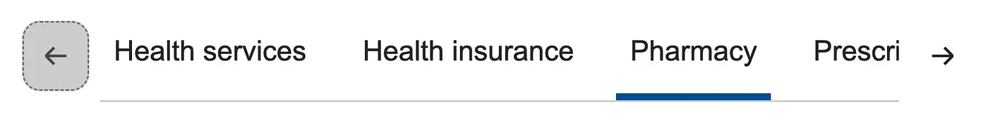
Figure 4: The Tab component horizontally scrolls when content cannot fit within the viewport.
The key normative language in this success criterion is any dragging can also be “achieved by a single pointer without dragging”. To conform to this, the Tabs component comes built-in with buttons named Previous Tab, and Next Tab.
This provides accessible functionality for people who “cannot perform dragging movements in a precise manner” and people who “use a specialized or adapted input device, such as a trackball, head pointer, eye-gaze system, or speech-controlled mouse emulator, which may make dragging cumbersome and error-prone.” — Understanding SC 2.5.7: Dragging Movements (Level AA).
2.5.8 Target Size (Minimum) (AA)
The size of the target for pointer inputs is at least 24 by 24 CSS pixels, except where… Inline: The target is in a sentence or its size is otherwise constrained by the line-height of non-target text;
All the interactive components provide consuming teams with a path to conform to this success criterion. This is because the system was built with the intent to conform to 2.5.5 Target Size (Enhanced) (AAA) which states: “the size of the target for pointer inputs is at least 44 by 44 CSS pixels”.
This means that all our interactive components are sized to be at least 24 by 24 pixels.
For example, the Radio Buttons have a minimum height of 44px in both the component for Figma and the coded version.
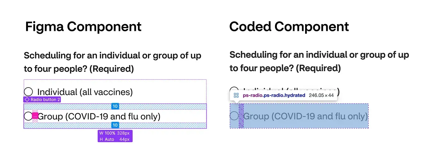
Figure 5: A comparison of the Figma and coded components for the Radio Button component.
The only component that does have a minimum height of 24 CSS pixels is the Inline Link component. However, that is covered under the Inline exceptions for this success criterion:
The size of the target for pointer inputs is at least 24 by 24 CSS pixels, except where… Inline: The target is in a sentence or its size is otherwise constrained by the line-height of non-target text;
Since WCAG conformance is just a minimum requirement for the design system, it was strongly encouraged consumers to always use the Typography design tokens, as well as follow the Inline Link content guidelines. This provides teams with the tools they need to create the most accessible inline links they can.
3.3.7 Redundant Entry (A)
Information previously entered by or provided to the user that is required to be entered again in the same process is either auto-populated, or available for the user to select.
This success criteria highlights why a design system is more than just a collection of components, it also includes documentation and many other elements. Redundant Entry is not something that directly applies to a component, but instead it applies to the component guidance. Therefore, it is the consuming team’s responsibility to ensure guidance is followed.
Redundant entry is specifically called out, with a link to more information about the new success criterion created by the Inclusive Design team. I wrote this following in our Forms pattern guidance:
Redundant entry
Avoid requiring users to enter information they already provided.
Consider using a method to pre-populate the information given or allow users to select it.
Learn more about Redundant Entry [link to internal resource]
3.3.8 Accessible Authentication (Minimum) (AA)
A cognitive function test (such as remembering a password or solving a puzzle) is not required for any step in an authentication process unless that step provides at least one of the following:
- Alternative: Another authentication method that does not rely on a cognitive function test.
- Mechanism: A mechanism is available to assist the user in completing the cognitive function test.
- Object Recognition: The cognitive function test is to recognize objects.
- Personal Content: The cognitive function test is to identify non-text content the user provided to the Web site.
The only component that currently exists in the design system and relates directly to authentication is Input Password. This component conforms to 3.3.8 Accessible Authentication (Minimum) because it is built to accept pasted values and does not prevent a password manager from being used.
Therefore, it has a mechanism to assist the user with the cognitive function test (password). Once again in the guidance, I made it clear not to override these settings when consuming the component.

Figure 6: The Password Input component is also built-in with a show/hide functionality.
3.3.9 Accessible Authentication (Enhanced) (AAA)
A cognitive function test (such as remembering a password or solving a puzzle) is not required for any step in an authentication process unless that step provides at least one of the following:
- Alternative: Another authentication method that does not rely on a cognitive function test.
- Mechanism: A mechanism is available to assist the user in completing the cognitive function test.
Just like the Minimum (AA) version of this success criterion, the only component in the design system that relates directly to authentication is Input Password. This mechanism described in the previous section to assist the user in completing the cognitive function test, also applies in the AAA version.
Important note: Before jumping into how we made our components conform, it is very important to note while components and guidelines help us conform, they cannot actually ensure it. There is still a huge dependency on consumers adopting the design system, following guidance, and implementing it as intended. This is why we have our expert teams, Inclusive Design and Accessibility Engineering, directly support the design system and consuming teams.